Lines, lines, lines
- Project Britzpetermann Identity Experiments
- Client Personal
- We love searching for the right lines, lines, lines,…
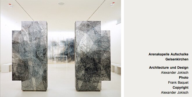
During our identity process, we created a visual for Britzpetermann. The goal was to express how basic forms emerge to new structures. During the process we were influenced by the art of Alexander Jokisch. He decomposes known form and recomposes them by using mostly straight and parallel lines.
Projectdetails
Lines experiments
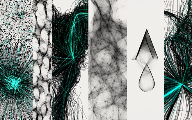
We initally tested three approaches simulatneously to create new structures.
We first used a point cloud and connected each point with each other. The intensity of the line depends on the distance of the two points. The result is a drawing tool with an optional image, where you can create those points.
We liked the results, but the output seemed a little too antiquated due to the emgering net structures.
Second approach was to use attractors to steer the creation of lines. Here the results are very dynamic however, chaotic and not meeting the goal of combining basic forms to new structures.
Third and final approach was to define blocks of parallel lines and composing them. This attempt came closer to our requirements and we decided to dig deeper. It is still a bit boring and the resulting moire patterns are not so nice, especially with less than 300 dpi.
We extended the basic form to a more curved line pattern by modifying the direction of the lines within a pattern block. This should add more complexity, depth and add a nicer moire pattern. We also added a slightly modified line. In some cases they are not straight and slightly transparent. In effect, the moire is much nicer and the resulting image depth is deeper.
Final step was to dig deeper into how a pen draws on paper. Therefore we used an even more refracted line and combined groups of lines with blendmodes. We also added new ways of distributing the patterns to create a more interesting composition. Actually, the result looks more like pen and paper however, it is too chaotic for our requirements.
Finally we decided to combine the straight line pattern results with those from the curved lines as brushes in Photoshop. Doing this we reached our goal of having a nice composition and creating depth from basic patterns.
Links
-
VISIT Results in our Britzpetermann Identity


Malte
wrote on August 1, 2010, 21:23
Ts, ts, ts. Hidden treasure. Looks fantastic and it is fun to play around with it. Genious. ;)
Maria
wrote on August 5, 2010, 00:54
great explorations! : )
Melle
wrote on August 18, 2010, 16:05
I love the Point Line!
Ling
wrote on March 11, 2011, 02:17
Amazing and beautiful. Genius.