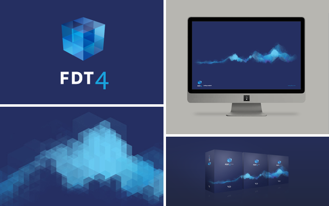
FDT 4.0 Corporate Design
- Kind Corporate Design
- Client Powerflasher
- Our Part Corporate Design, Art Direction & Design, Visual Programming
- We love finding a new brand, generative design
The Multimedia Agency Powerflasher in Aachen which is also responsible for development and distribution of the Software tool, gave us the order to create a new logo and visual for the new launch.
The brand image had to be worked out completely new. Important here was that the high professional quality of the software tools reflexes in realization.



Projectdetails
Product
FDT is the standard development environment for professional AS2/AS3 and Flex-programming. FDT improves the development-workflow and increases the productivity with high-efficient and time saving features.
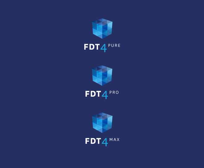
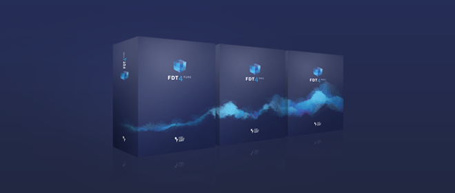
FDT is offered in 3 different versions: Pure, Plus and Max.
Realization
We have started with searching for attributes which are supposed to demonstrate the new brand. We focused on joy and maturity as coding is fun.
To emphasize the nature FDT we early decided to generate the visual computer – coded with FDT and executed by the flash player. We tried to abstract from the code and show what it means for the developer.
The basic topic was found quickly. A cube seemed to be appropriate for us when building things. On the one hand, because the cube with its geomatrical basic design is quite suitable to visualize the process of development. Its about building great architectures from simple structures and subsystems. On the other hand the cube is a homage to the old FDT logo, which already demonstrates the development on basic.
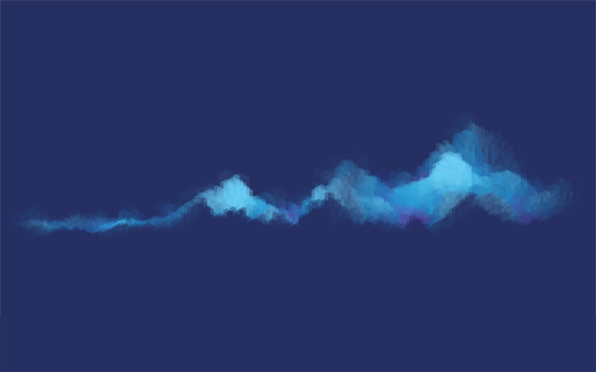
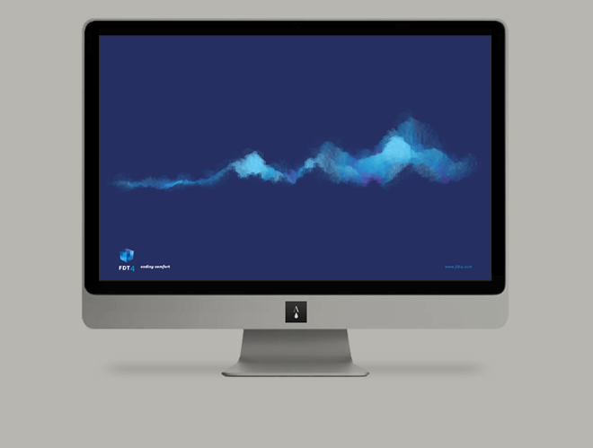
Our next step was to create a visual. We tried different things like abstract arrangements of cubes or using patterns to distribute them or generate a kind of landscape. 2D and 3D optic was important as well as coloring and shading.
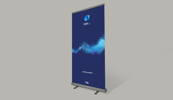
At the end there was a whole landscape consisting of cubes. This allegory seemed to be most favourable to match the topic of maturity, further development and to enjoy creating things. The landscape is also very helpful to demonstrate the three different product editions – refer to the packshots.
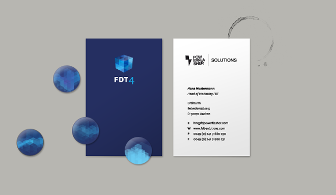
Finally the new FDT logo was designed. The blip/figurative mark is a cube with perspective projection designed by smaller cubes. Even here the topic ‘growing up’, further development is given but at this time combined in a concrete form.
The word mark is plain and rather supports the logo instead of being obstrusive. By using the wonderful font National, the corporate typeface of Powerflasher, the origin of the tool is emphasized.
More insights into the FDT4 visual development process is here
Wallpaper Creator
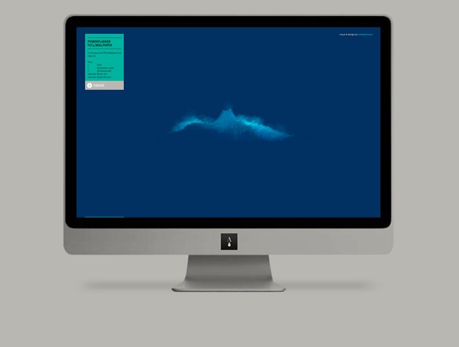
After our successful work on the new Corperate Design, we were asked to take our generative approach a little further to create some viral buzz. In collaboration with our client we decided to take the tool that we had used to create the new visual and built a Wallpaper Creator that users can use to create there own personal Wallpaper and give them the possibility to share it with their friends on facebook and twitter.
Links
- VISUAL EXPERIMENTS Our experiments for the visual
- WALLPAPER CREATOR Create your own wallpaper
-
FDT4 Visit the Website


Britt King
wrote on September 12, 2010, 00:48
Wow, really incredible stuff. Very impressive brief and showcase of your work. I especially like the insights into the development process.
Arne Deutsch
wrote on September 13, 2010, 07:46
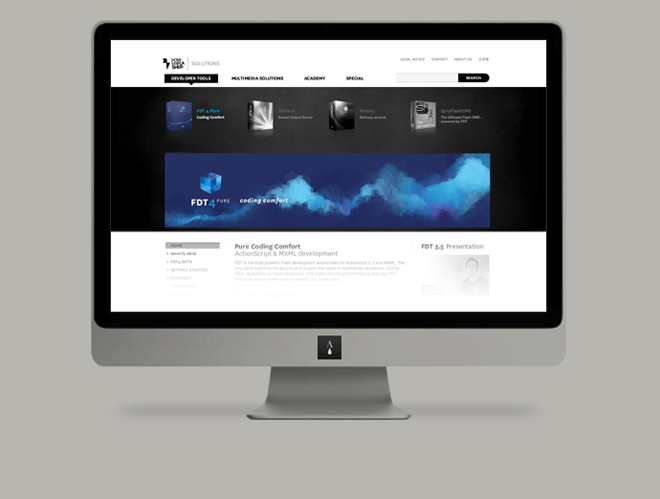
Yeah, the insights in the development process are great. Would be interesting to get a connection between the experiments and the development process. I love the logo while it will take some time till I can live with the landscape. A bit surprising that the work is shown here before used at the FDT website ;).